Good morning, and welcome back. We had a four-way tie for Flag of the Week last week, so we will have to delay crowning our first ever winner. No flag design news this week, but WaPo published a set of letters to the editor all about flags, and the New York Times published an interesting piece on how the Trump campaign is using the American flag.
Today is our third post on the conventional wisdom on flag design. We continue to walk through the pamphlet Good Flag Bad Flag (GFBF), published by the North American Vexillological Association. As a reminder, these principles are:
Use 2-3 basic colors
No lettering or seals
Be distinctive or be related
The third principle is possibly my least favorite. It does not make much sense and is riddled with strong counterexamples. Also, the real work that it is doing is picked up by other principles like “keep it simple” and the principle against lettering and seals. I wonder whether it is even worth being called a principle at this point.
Use 2-3 basic colors
From GFBF: Limit the number of colors on the flag to three which contrast well and come from the standard color set.
Let’s unpack the principle a little bit. First order of business, what’s a basic color? What is the standard color set? Take a second yourself to think about it. I thought I was an uncultured oaf when I realized I had no idea what the standard color set was. If I had to take a guess, I would say the seven colors of the traditional rainbow, plus black and white. Or maybe the three primary colors plus black and white. ChatGPT said six colors of the traditional rainbow (no indigo), plus brown, black, white, and gray.
There does not seem to be a proper definition anywhere. GFBF defines the standard color set as red, blue, green, black, yellow, and white. As I show below, this feels a bit limiting. GFBF notes that other colors like orange and purple can be used, but that “they are seldom needed in a good design.” Assertive.
Next order of business, the number or arrangement of colors. GFBF provides a bit more guidance. GFBF of course calls for 2-3 flags, but also for dark colors to be separated by a light color (think the French flag), and light colors to be separated by a dark color.
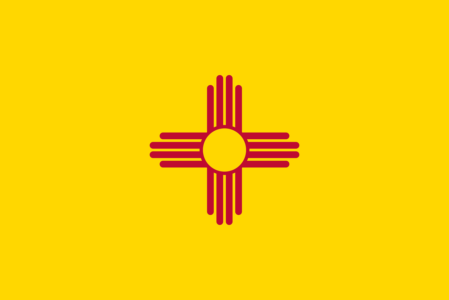
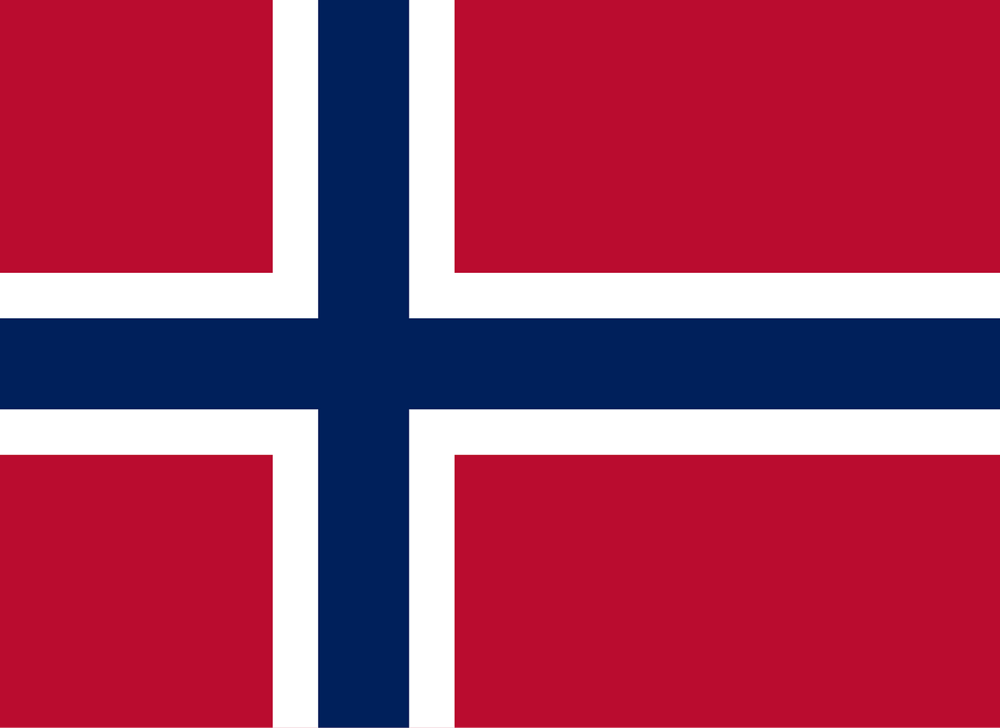
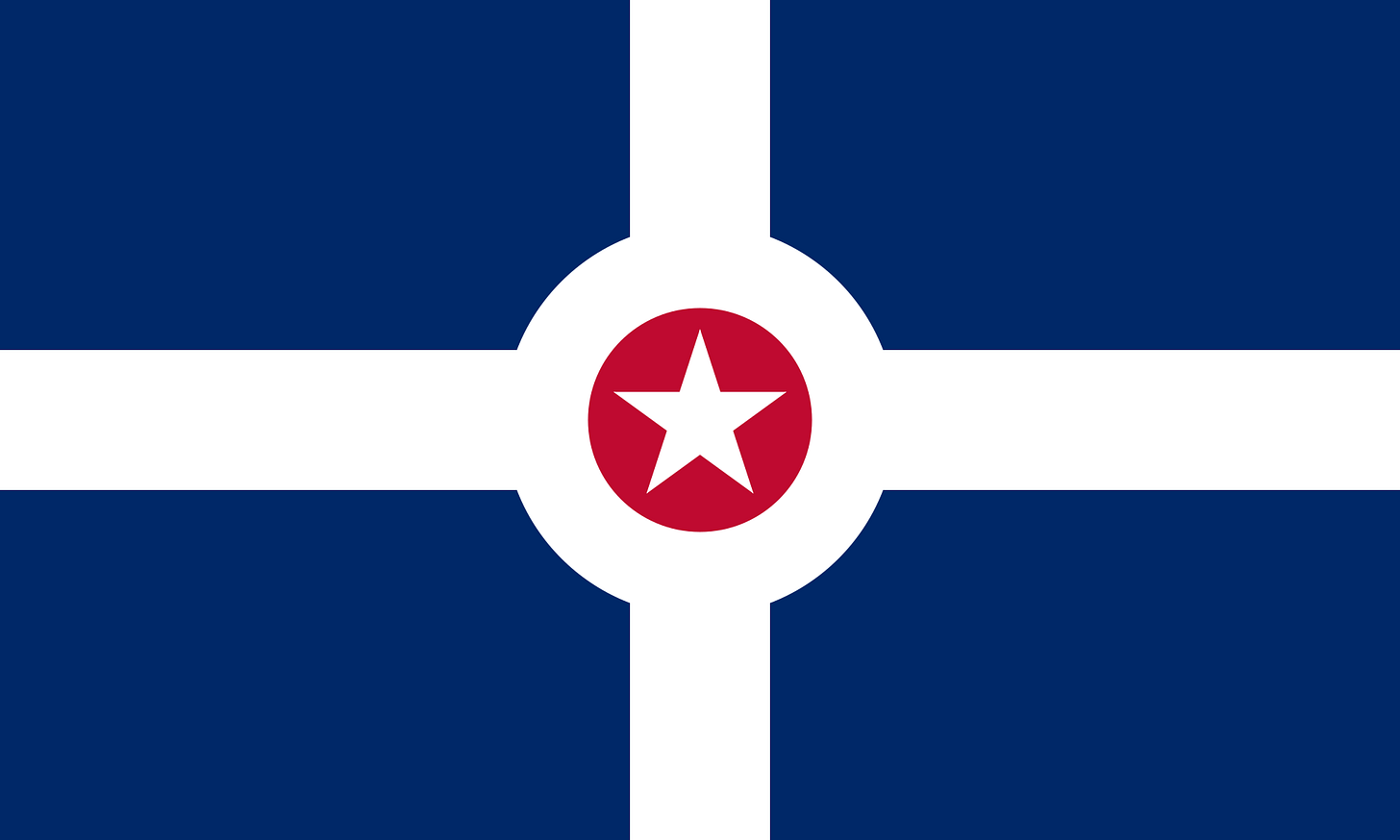
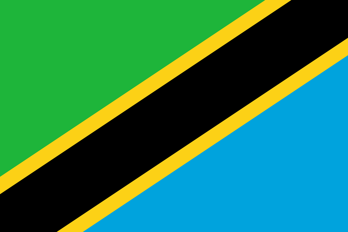
Here are some flags that squarely meet this principle.
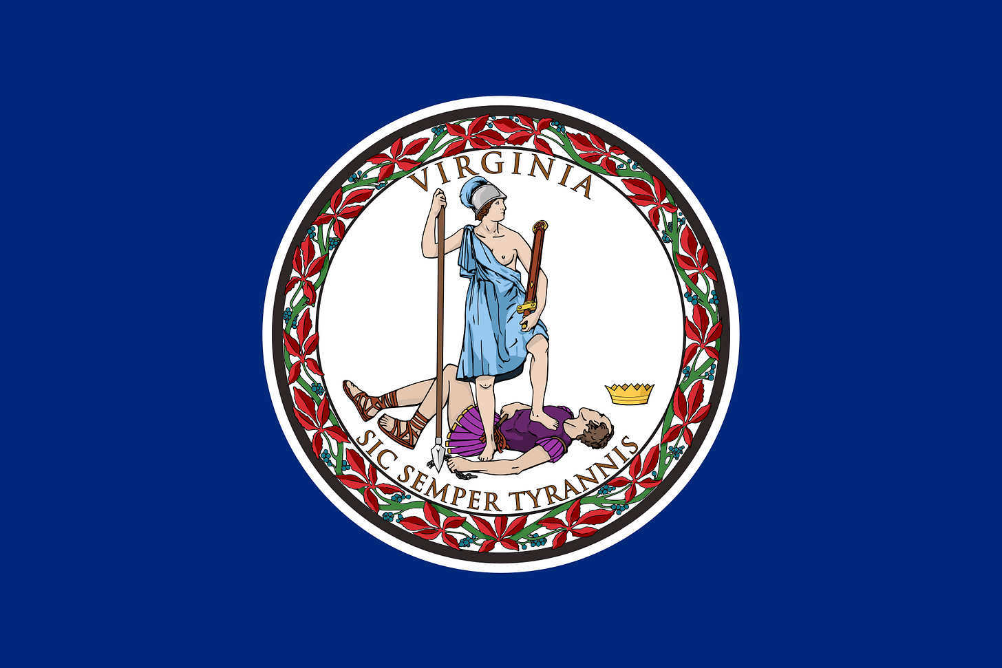
It’s clear what work GFBF wants this principle to be doing. Naively adding a bunch of colors to one flag can result in flags that clash and can become messy. Pragmatically, GFBF points out that the more colors a flag has, the harder and more expensive it is to manufacture. Here are a few examples of flags that have too many colors, all plucked from GFBF.
These flags are all bad. But note that the “keep it simple” principle arguably covers these flags. Applying the “keep it simple” principle would lead a designer to strip the seal from Dominica’s flag. It would lead a designer to enlarge the dragon in the admiral’s flag. And the “keep it simple” principle, or the principle against seals, would call for a facelift of Virginia’s flag. Other than maybe that admiral’s flag, none of these flags strike me as having too many colors as a core issue.
Part of the reason this principle is weak is that it draws an arbitrary line around what colors should be on flags. Here are the top three flags from the North American Vexillological Association’s recent survey of city flags. In this survey, they only assessed new city flags or flags that they did not assess in their inaugural survey in 2004.
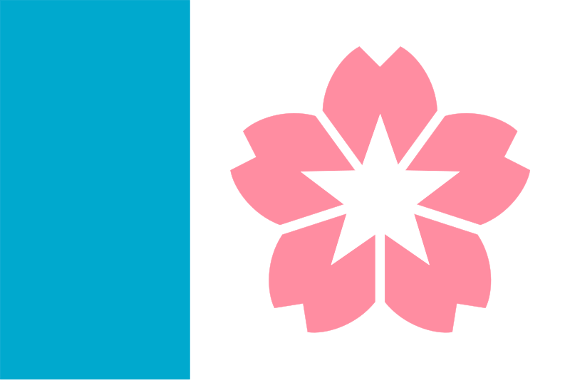
Notice anything interesting? Each flag has a non-approved color. Tulsa has gold and beige (plus it breaks the three-color rule), Reno has gold and gray, and Salem has pink. Tulsa’s flag in particular is great, with the shield referencing the Oklahoma state flag, and the red representing the victims of the Black Wall Street massacre.
Some of you may be queuing up to write to me saying that the principles are just principles, and can be broken. But query how valuable a principle is if it is this prone to error, and not predictive of the three highest-rated flags in a survey by those supposedly espousing the principle. The other four GFBF principles are all reflected in these flags designs. The “use 2-3 colors” principle is not.
Here are some more flags that violate one, or both of using 2-3 colors and using “standard colors.” Tell me if any of these flags are not great.
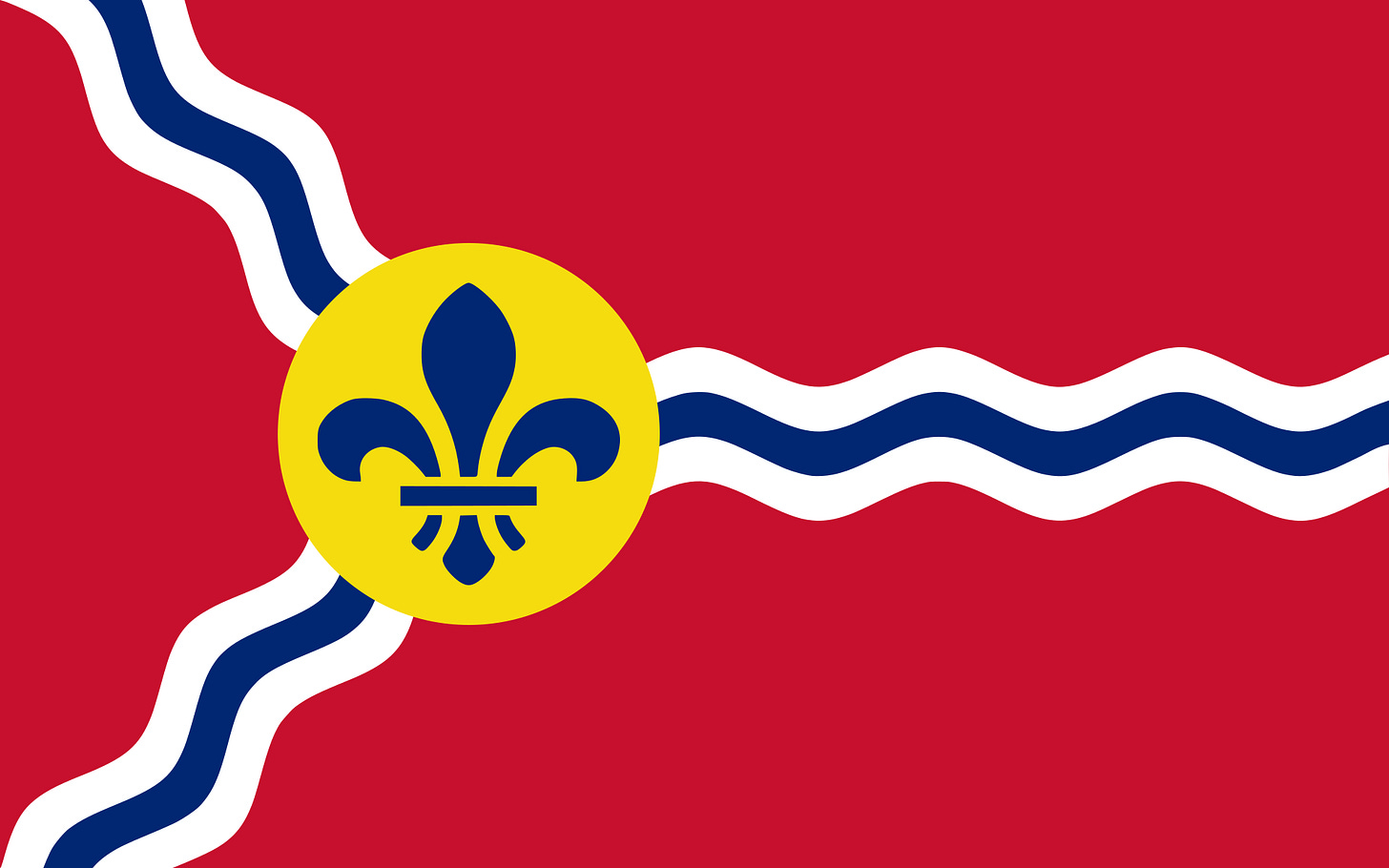
Again, all of these flags are comfortably picked up by the other four principles. They are all simple. They all have great symbolism. Hokkaido—in the north of Japan—has a stylized snow flake, while Kennebunkport’s symbolism screams New England seaside. St. Louis’s flag is a masterpiece, symbolizing the city’s French history and position along the Mississippi and Missouri rivers. Not to mention, it was designed by a Yalie. And as a preview of coming attractions, none of these flags have any annoying lettering or seals, and all of them are distinctive (and in the case of Hokkaido, related to the other prefectural flags of Japan). Yet the 2-3 colors from the standard color set principle fails miserably here.
As I mentioned in my first post on GFBF, the word “principle” carries quite a bit of weight. It leads to litmus tests and quick conclusions about flags. When a principle is this prone to error, and does such little independent work, it is hampering the design process more than helping it.



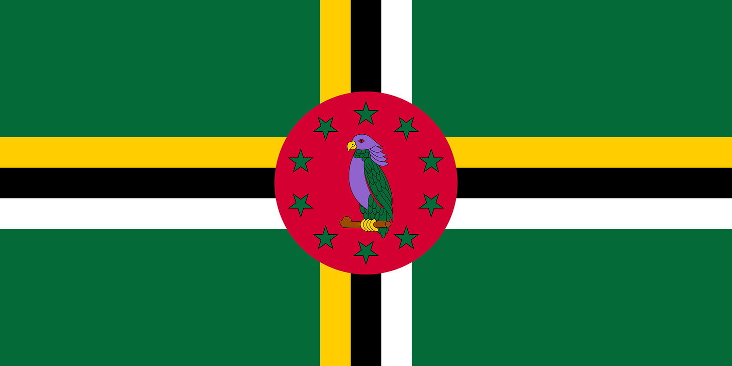





Okay but I still love Dominica’s flag though
Anything’s possible at the flag poll !!!!