Flag Design Principles Pt. II: Use Meaningful Symbolism
Good morning, and as always, thanks again for taking the time to read The Flag Poll. It is such a treat to see folks interacting with the blog. Several readers texted me, one sent me a voice note, and another sent me pictures of their local flag out in the wild.
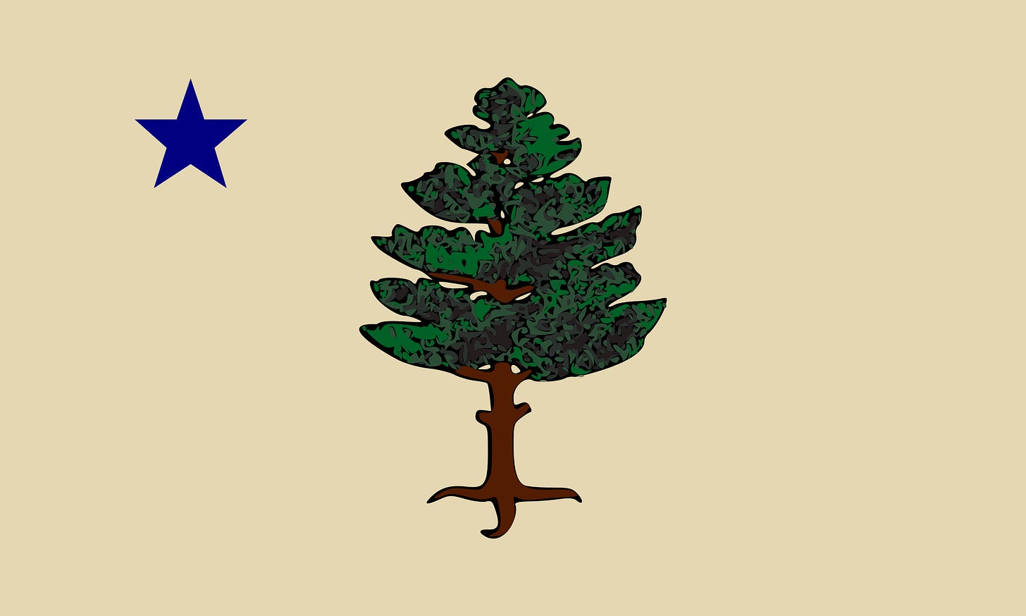
We start this week with some flag news! A loyal and passionate reader sent me this New York Times article: Maine is changing its flag! The state has asked flag designers for ideas ahead of a referendum in November in what will be the most important vote in the state. On the ballot will be the new design versus Maine’s current, boring flag. I would be shocked if the current flag won. It is a classic American state flag: boring seal on a boring background
The state’s own design memo is thoughtfully drafted, though quite limiting. It asks for a flag so simple that a child can draw from memory and that is easily seen from a distance. Sound familiar? For readers of last week’s blog, oh yeah. I just wrote the book (well, the blog) on keeping it simple (here if you somehow missed it). Another key point is that the design must be based in large part on Maine’s former flag.
From Secretary of State Shanna Bellows’s office:
The background color must be buff (author’s note: that’s that strange shade of beige);
A pine tree proper must be in the center;
A five-pointed North Star in blue must be in the upper corner;
The star must be equidistant from the pole side and the upper border of the flag; and
The distance from the pole edge and upper edge to the center of the star must be equal to about 1/4 of the pole side edge length, this distance and the size of the star must be proportionate to the size of the flag.
Doesn’t leave a lot to creativity. Many Mainers already fly a version of this flag that is—at least for now—the best bet to be the nominee. It uses a simpler pine tree pulled from the state’s merchant marine flag. I don’t love this version of the pine tree, but it is cleaner and simpler than the 1901 flag.

One reader and Mainer noted the flag “has the potential to be best flag in the history of the world.” I would not go so far, though Maine would certainly jump into the top 10 of state flags. I am curious to see what flag designers come up with given the strict instructions. It is a bit of a shame about the buff, though that will certainly make the flag unique. For those curious, buff is traditionally associated with George Washington. Buff and blue were the colors of his uniform and are to this day the colors of George Washington University. Delaware’s flag features some buff as well. The connection to Maine seems somewhat tenuous, but anything is better than the boring blue banner Maine has now.
Watch this space! Designs are due next month.
Back to the Maine point of these introductory blogs. This blog is the second of a series of posts aimed at introducing you to the basic tenets of flag design. Last week, and as mentioned above, I covered the first of these tenets: keep it simple. I intended to cover these tenets over three posts. But I am starting to think that it is going to take more than three posts to do so, so strap in. I am also introducing a weekly flag of the week competition where you can vote for your favorite flag discussed each week. That will be at the end of each post. You all know I am all about generating #content and #engagement.
As a reminder, the conventional wisdom on flag design is the pamphlet Good Flag Bad Flag (GFBF), published by the North American Vexillological Association. In fact, Maine’s flag design memo explicitly referenced rules of thumb and key principles from GFBF. These principles are:
Keep it simple
Use meaningful symbolism
Use 2-3 basic colors
No lettering or seals
Be distinctive or be related
Today, we will cover the second of these principles: use meaningful symbolism. I’ll give an overview of the principle and give examples of flags that have great symbolism, and how symbolism can arise. As I explain, few flags have “bad” symbolism, so this principle is one that is quite hard to break. At its core, this principle is really an anti-arbitrariness principle: don’t put things on flags that don’t mean anything.
Use Meaningful Symbolism
From GFBF: The flag’s images, colors, or patterns should relate to what it symbolizes.
In my opinion, this is the most obvious principle of all. We should never forget what the point of a flag is: to represent people and communities. As I mentioned in the first ever post on this blog, flags are like introductions to these communities. They tell us what the community cares about and prioritizes. GFBF wisely tasks designers to consider “history, cultural heritage, emotional value, branding, and usage” in picking symbols.
Symbolism can come in many forms, too. Sometimes it’s simply the colors of the flag. Every Armenian child knows what the red, blue, and orange of our national flag stand for. As you examine the flag, try and take a guess (bonus points if in Armenian).
I just realized I think I am the only Armenian subscriber. As I learned it, red stands for the blood of those who sacrificed themselves for Armenian freedom, blue stands for the skies above Armenia, while orange stands for Armenia’s bountiful grain harvest. The Armenian Constitution has a slightly different definition, but to each their own. This possible range of meanings does admittedly weaken my choice of the Armenian flag as the first example of one with meaningful symbolism.
Another great example is the Irish flag. That tricolor flag features green (representing catholics) and orange (representing protestants) with a white band in the middle to symbolize peace and unity. As a flag, it says a lot. Irish revolutionaries started flying the flag in the 19th century, but it really took off in the 1910s to symbolize the goal of unifying Ireland and creating an Ireland for all.
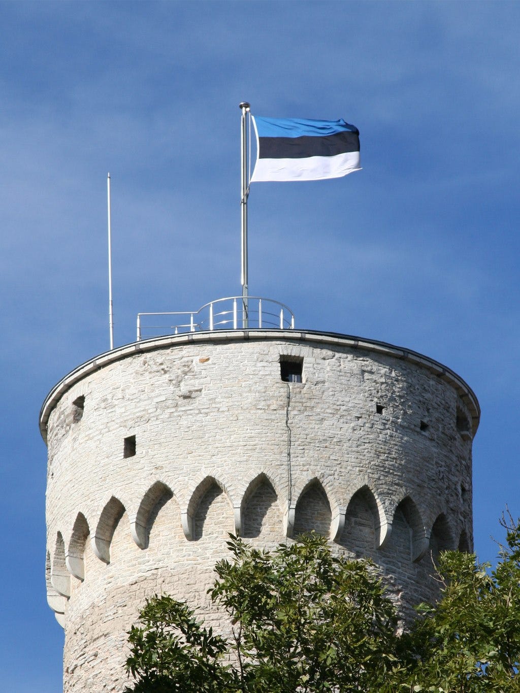
Some colors on flags are meant to paint pictures. As GFBF notes, Ukraine’s ubiquitous flag is simply a sky of blue over a field of golden grain…not too different from the symbolism in the bottom two-thirds of the Armenian flag. Some have argued that Estonia’s flag has a similar origin, representing the sky over a dark forest in a cold Estonian winter. I’m inclined to think that’s just a coincidence, but it is certainly a happy one.
And sometimes the symbolism is not so obvious. France and Italy began using vertical tricolors in the late-eighteenth century, a time of revolution. The vertical stripes on the French and Italian revolutionary flags stand in stark contrast to the horizontal stripes that dominated European flags at the time. The Austrian Empire, Netherlands, and Spain for example, flew flags with horizontal stripes. The vertical stripes were a sharp break with this tradition.
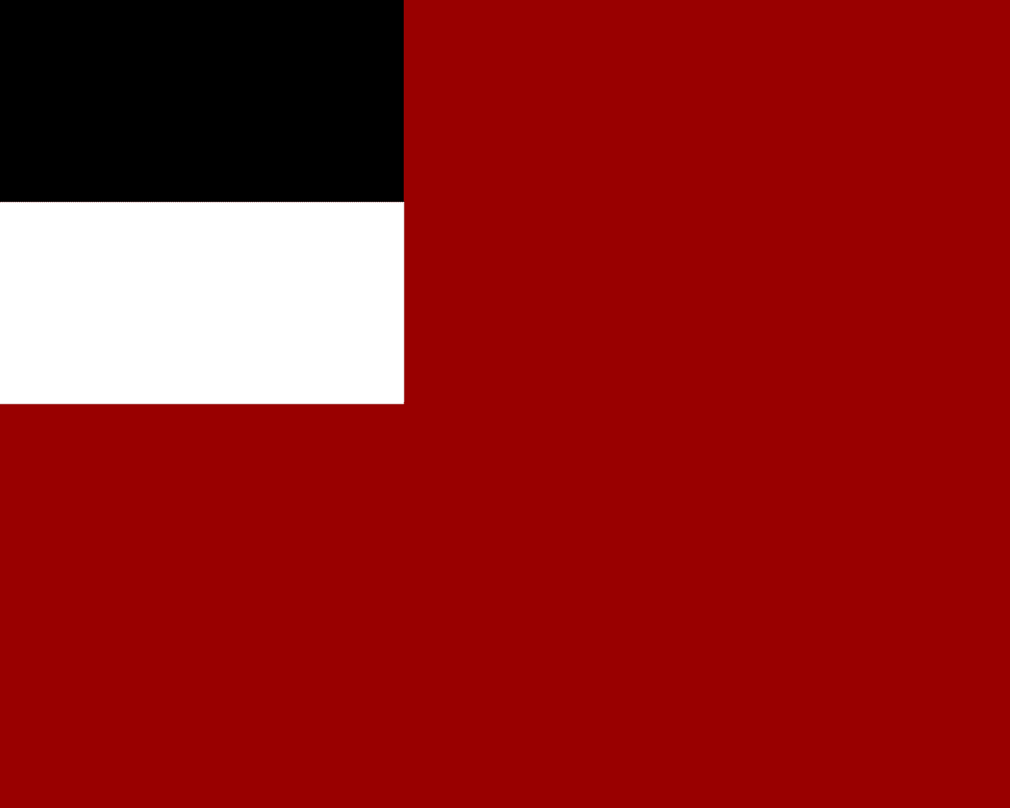
History is also a source of symbolism, insofar as the flag itself, or elements of its design, are steeped in a country’s history. The Armenian flag we now fly was also the flag flown by the First Republic of Armenia, which lasted from 1918-1920—after the Armenian Genocide and Russian Revolution, but before Soviet occupation. Georgia (the country, though the state has had its fair share of vexing vexillological history) made a similar decision when it freed itself from Soviet rule, flying the flag of the Democratic Republic of Georgia which lasted from 1918-1921. Both the Armenian and Georgian flags had been banned under Soviet times, and so using them as the symbol for a new nation was a powerful move. In 2004, Georgia reached seven centuries further into its historical bag and changed its flag once more.
Symbolism can extend to graphical elements as well. South Africa’s flag flown after the end of Apartheid combined many of the old colors used in South African flags. Its chief design element is meant to represent a road of unity as the country entered its post-Apartheid era.
As another example, consider the flag of Barbados, yet another wonder from the vexillological hotspot that is the Caribbean. The blue on the flag represents the sea and sky, and the yellow represents sand. So far, this all makes sense for an island nation. But the trident takes this flag to another level. That trident is a callback to the Barbadian colonial coat of arms, which featured a woman (presumably Queen Victoria) holding a trident. The broken trident represents Barbados’s break away from the United Kingdom. It’s just an awesome flag, replete with symbolism on so many levels.
One other great example is the flag of the Oglala Sioux. The tepees are of course traditional homes of the Oglala and many other Indigenous peoples in America. There are eight tepees, representing the eight districts of the Pine Ridge Reservation, where the majority of Oglala Sioux live. The tepees are in a circle, with their points forming a star, representing strength and community unity. And the red color has a whole host of traditional meanings, as well as representing the blood spilt by the Oglala in their resistance to the United States.
One last example. GFBF’s exemplar of a flag with meaningful symbolism is the Iroquois Confederacy flag. It’s another masterpiece of a flag. The main design element is the Hiawatha Belt, a wampum belt that is a centuries-old symbol representing the five tribes of the Iroquois Confederacy. The tree at the center represents the Onondaga tribe and the Tree of Peace in its lands at which the Confederacy was born. Purple (not blue, as GFPF notes) is the color of the Iroquois Confederacy as it is the color of the shells used to make wampum.

It is always difficult critiquing a flag for having bad symbolism. After all, who are we to tell a community what they should or should not be symbolizing on their flag! Imagine telling a Barbadian the broken trident is a bad image of resisting British colonialism…could not be me.
That’s why most critiques of flags on the basis of having poor symbolism are generally paired with a critique about the design itself. For example, GFBF calls out the design of the Organization of American States’ (OAS) flag. OAS is an international organization, the membership of which includes most states in the Western Hemisphere. Its flag is a monstrosity.
The symbolism is actually quite meaningful; the flag shows the flags of all component members. Should the US drop out, its flag would presumably be excised. So really GFBF is calling out the flag for having a complicated design, not for its symbolism per se.
Compare OAS’s flag to that of ASEAN, a similar type of entity but instead one representing Southeast Asian nations. ASEAN’s flag includes a bundle of ten rice stalks in the middle, which represents the region’s most important crop as well as the ten members of the group. This flag has at least equally meaningful symbolism as OAS’s flag, and is just a much simpler design.
GFBF has a sensible design objection to the old flag of Libya, which was just a solid green flag with nothing else on it. GFBF noted the flag’s color was to symbolize Islam. GFBF actually undersells the symbolism. Green represented much more than just Islam, as Colonel Gaddafi had published The Green Book in 1975, just two years before the adoption of the solid green flag. The Green Book laid out Gaddafi’s political views, and the green flag was only adopted after Gaddafi declared the Great Socialist People's Libyan Arab Jamahiriya in 1977. So there’s actually quite a bit of symbolism in the flag, even if it is just green. The problem is of course that the design is not distinct (see principle 5, forthcoming). At a distance, it could be confused for any flag that is predominantly green, like Washington’s. Or, and perhaps more likely, Saudi Arabia’s flag, which predates the Jamahiriya flag by at least fifty years.
The point is, the bar to call out a flag for bad symbolism is extremely high. It would take something like, say, allusions to the Confederacy (see principle 5, forthcoming) to independently violate this second principle of flag design. I think the principle more generally stands for a rule that flag design shouldn’t be arbitrary (or capricious). But we all already know that, right?
Make sure to vote in our flag of the week poll! As always, I am available at flagpoll.substack.com


